Exploratory Data Analysis
The following introduction is reproduced with minor differences from the original academic exercise:
“In the 1950s, the geochemist Charles David Keeling observed a seasonal pattern in the amount of carbon dioxide present in air samples collected over the course of several years. He attributed this pattern to varying rates of photosynthesis throughout the year, caused by differences in land area and vegetation cover between the Earth’s northern and southern hemispheres.
In 1958 Keeling began continuous monitoring of atmospheric carbon dioxide concentrations from the Mauna Loa Observatory in Hawaii. He soon observed a trend increase carbon dioxide levels in addition to the seasonal cycle, attributable to growth in global rates of fossil fuel combustion. Measurement of this trend at Mauna Loa has continued to the present.
The `co2` data set in R’s `datasets` package (automatically loaded with base R) is a monthly time series of atmospheric carbon dioxide concentrations measured in parts per million (ppm) at the Mauna Loa Observatory from 1959 to 1997. The curve graphed by this data is known as the ‘Keeling Curve’.”
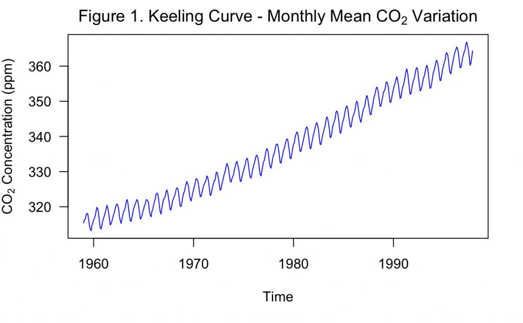
Figure 1, above, shows the Keeling Curve as generated by the built-in R dataset. In this exercise, this time series will be modeled and varying forecasts into the future will be produced.
Unlike traditional statistics, time series modeling includes additional assumptions and unique model structures not found in problems where there is no time involved component. These must be investigated before the time series data is used, regardless of whether the goal is to produce a forecast or solely examine relationships within the data.
To begin, it can be found that there are zero missing values. However, when inspecting the documentation of the dataset, it was noted that the months of February – April of 1964 were missing and filled in with linear interpolation. For the purposes of this exercise, these three measurements will be left as is. Overall, the measurements take place from January 1959 to December 1997, following the description that Keeling began in 1958.
From Figure 1, it is obvious that there is a positive trend that makes the series non-stationary in the mean. The mean of the series is about 337 ppm, which is clearly greater than the start of the series and lower than the end. It also appears that the variance could be increasing over time, with cycles being of greater amplitude later in the series than in earlier sections. Across the entire series, the standard deviation is about 15 ppm, which also appears greater than the amplitude of early cycles and closer in size to later cycles. This makes the series non-stationary in the variance as well. To address this increasing variance, the logarithm may be taken and examined.
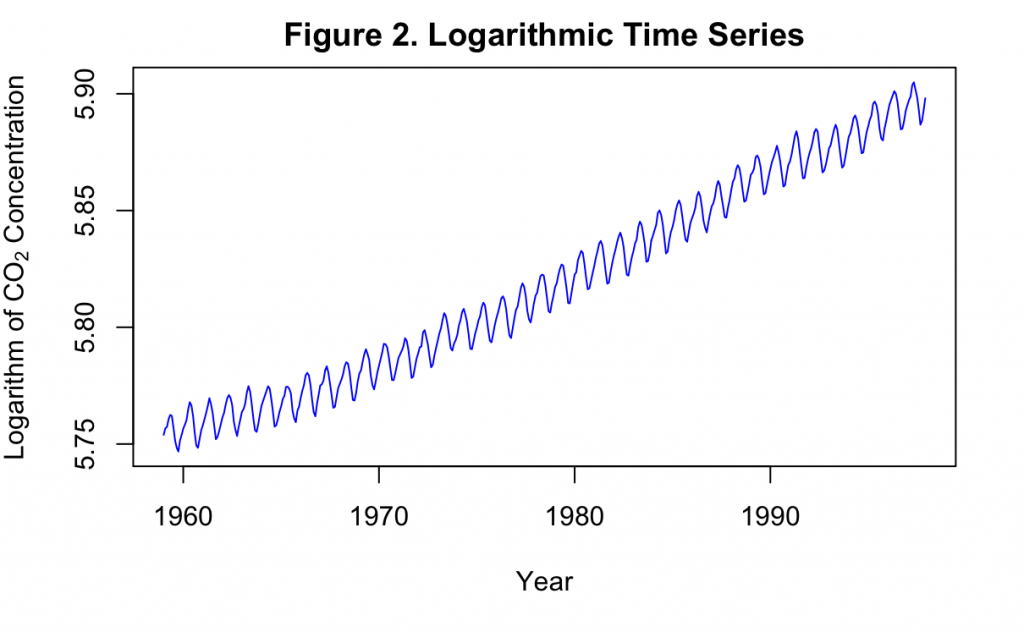
Shown in Figure 2, taking the logarithm appears to have better stabilized the variance over the course of the time series. Now the data can be considered stationary in the variance, but the positive time trend must still be examined. It appears as though the series could either have a first order or second order time trend, so both will be investigated.
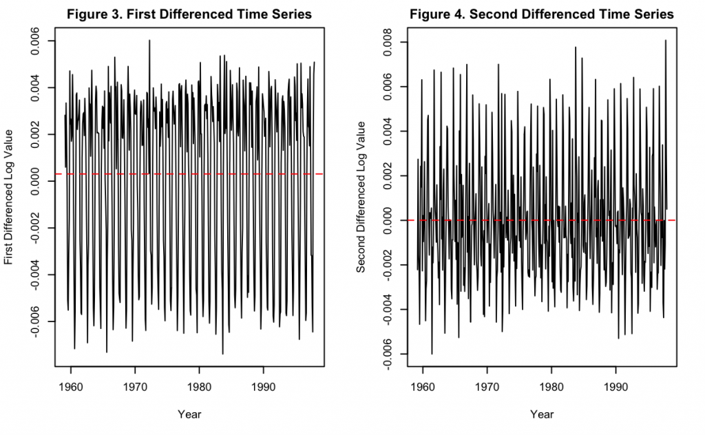
Figure 3 and 4 show the first and second differenced times series after applying the previous logarithm transformation. It can be seen in Figure 3 that the first difference does much to remove the positive time trend, but the majority of the data still appears to slightly fluctuate in the mean over time. For example, the second half of the data appears to have a slightly higher mean value than the first half. On the other hand, Figure 4 shows that after taking the second difference, the data appears to completely be stationary in the mean. Therefore, any model with this data should also take the second difference to achieve this.
Next, the seasonality and other elements of the data will be investigated.
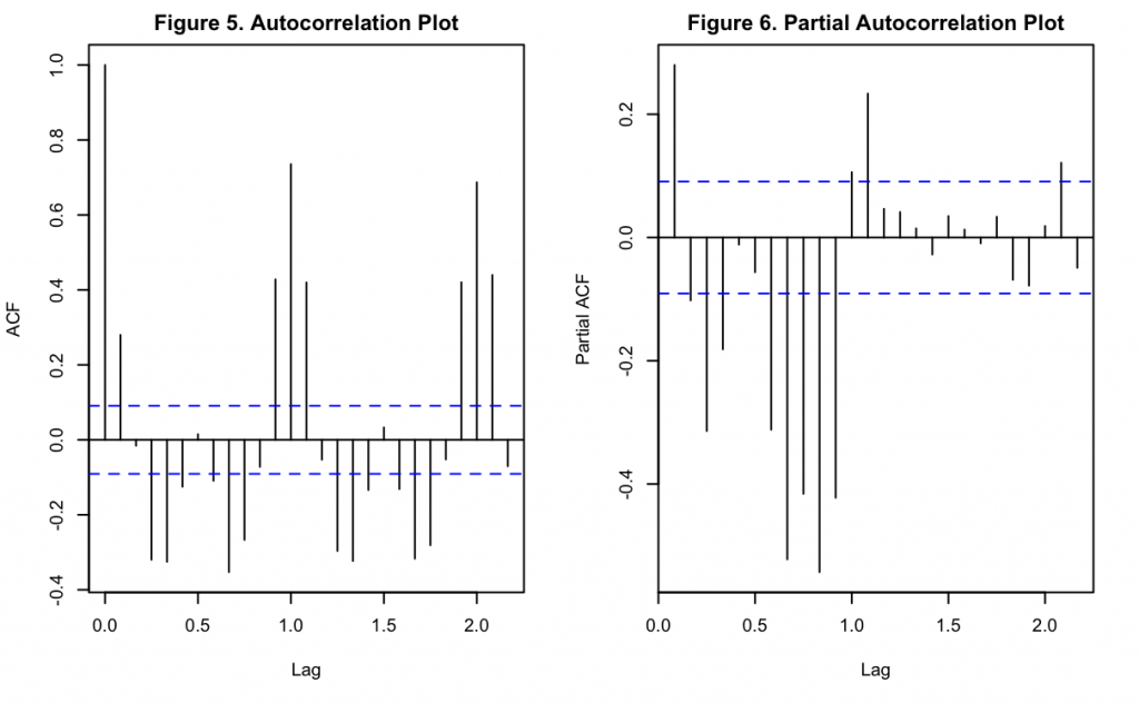
Figures 5 and 6 show the autocorrelation function (ACF) and partial autocorrelation function (PACF) of the data after the logarithm transformation and second differencing. It can be seen there is a significant lag at k = 1 and k = 2, measured in years. In between these points (and also for the subsequent interval) appears to be a repetitive oscillatory pattern indicating that there is seasonality to the data. This fits with Keeling’s original hypothesis that stated annual cyclic changes in the environment and vegetation would affect CO_2 concentrations in the atmosphere. Interestingly, the pattern in Figure 5 assumes a shape where whole number lags are significantly positive but intermediate lags are significantly negative, and with decreasing magnitudes over later time-period shifts. Similar to Figure 6, these oscillations appears to be decreasing in magnitude over time. These repeating patterns may explain seasonality in the time series, rather than being indicative of the non-seasonal autoregressive (AR) or moving average (MA) components. Full investigation of AR/MA components of the data will be continued later when exploring ARIMA models.
Linear Time Trend Modeling with Keeling Data
Before more complicated time series methods, a simple linear time trend can be used as a baseline against which to compare future iterations. A linear time trend is a specific type of linear time series model where the only independent variable in the model is time. That is, the model would take the form of:
x_t = \alpha_0 + \alpha_1*t + \alpha_2*t^2 + … + \alpha_n*t^n
for an n-th ordered polynomial with time series x_t, model parameters \alpha, and time t as a linear time trend. Note that the linear description of the model comes from the linear relationship of model parameters, and not the relationship with time itself. On this site, if the relationship with time is only of the first order, then the model will also be referred to as a Linear Model. If the relationship is of a higher order, then the model will be referred to as a Polynomial Model.
While in the EDA it was found that a logarithm and differencing operation was needed to make the time series stationary, linear time trends do not rely on any assumption of stationarity. Therefore, to start, a linear time trend of the first order will be fit to the raw data.
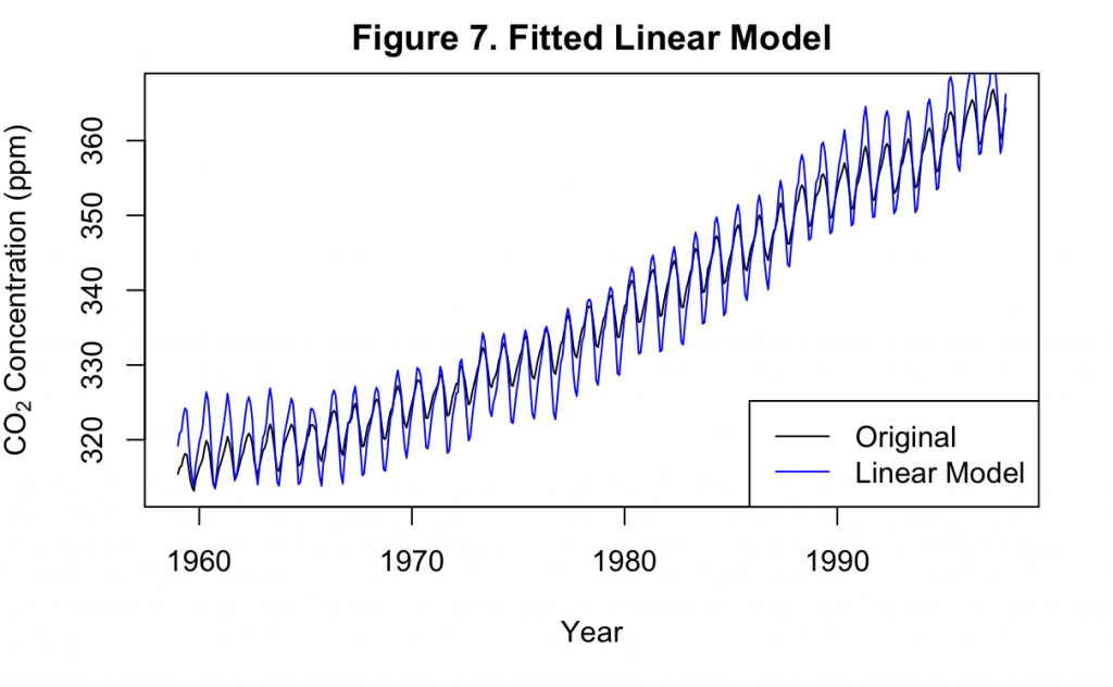
Figure 7 displays the fitted linear model of the first order overlaid on the original data. It can be seen that the linear model generally overestimates the amount of variance in the data, with cyclic amplitudes that are much greater than in the original time series. However, it is able to estimate the frequency of the cycles quite well, with an almost exact overlap between the crests and troughs of each series.
The correlation of the residuals produced by the model may be examined for an evaluation of the fit.
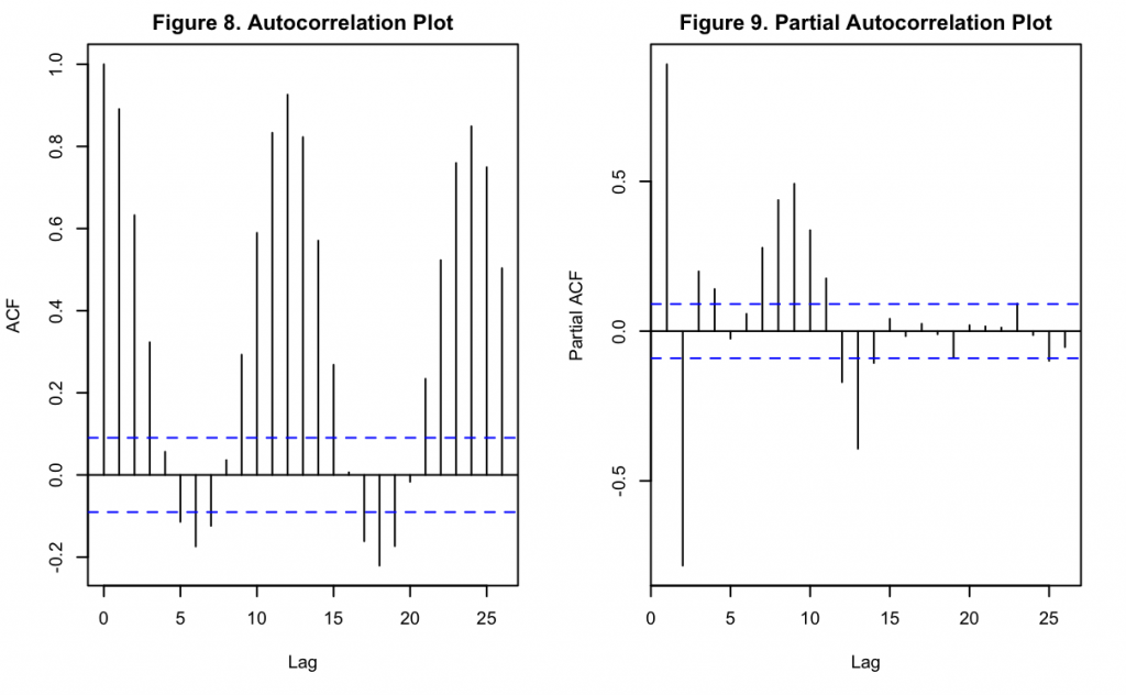
Figures 8 and 9 show the ACF and PACF of the model’s residuals, with the lags shown in months. A slightly damped oscillatory pattern can be observed in both, similar to Figures 5 and 6. This indicates that the model does not account well for the seasonal variation which is present in the original data. Based on Figure 8 and Keeling’s hypothesis, these appear to have a period of 12 months.
Finally, the residuals can be viewed on their own over time.
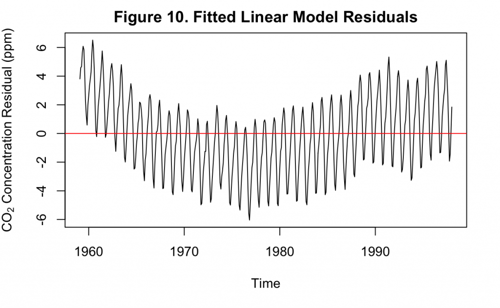
Clearly, the residuals in Figure 10 do not resemble a white noise series. At earlier and later decades, the residuals are consistently higher than the mean. In the middle of the time series, however, they are consistently less than the mean. This demonstrates that there are still components in the original time series that have not been accounted for by the linear model. It is also a reflection of what a first order linear model may achieve on non-stationary data, where the two sole model parameters only capture the average trend over the data. When this trend is not constant, the fit over the data is uneven.
For a better fit, a polynomial time trend can be estimated.
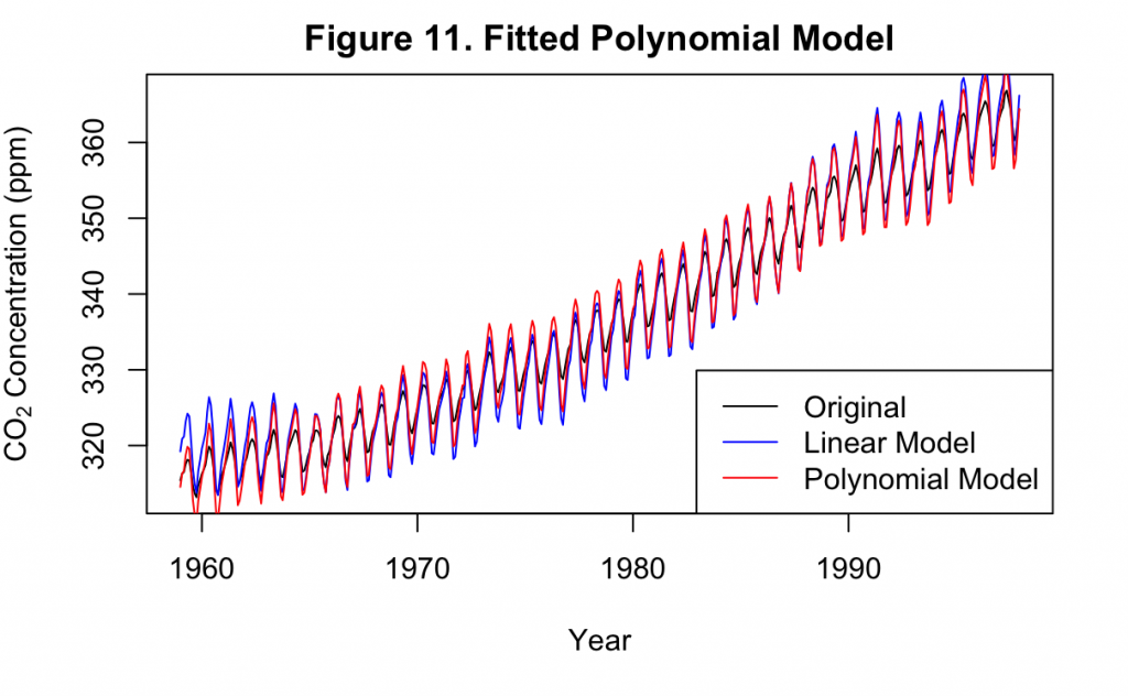
Figure 11 overlays the fitted time trend model of the third order with the original linear model of the first order. Except for a few repeated locations, the linear and polynomial models mostly overlapped one another closely. This indicates that using higher orders of time trend alone will not improve the model while the seasonality is still not addressed.
The use of seasonal dummy variables in the model can attempt to address this.
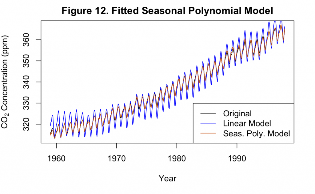
Demonstrated in Figure 12, the use of seasonal dummy variables for each month results in a polynomial time trend model with a dramatic improvement. This is both compared to the original linear model, as well as the previous polynomial model without any seasonal components. Now, instead of greatly exaggerating the annual variance, the cycles appear to overlap much more closely with the original time series.
The residuals of this model will be examined similar to what was done for the linear model.
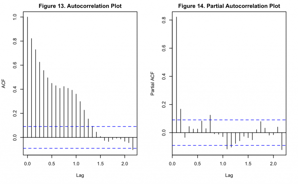
Figures 13 and 14 display the ACF and PACF of the residuals from the polynomial model with seasonal dummy variables. The cyclic components found with the linear model in Figures 8 and 9 are no longer visible in these examples. Figure 13 shows heavy autocorrelation until lag ~15, while Figure 14 shows that the first lag still has a very significant partial autocorrelation associated with it.
The residuals appearance can also be directly examined as done previously.
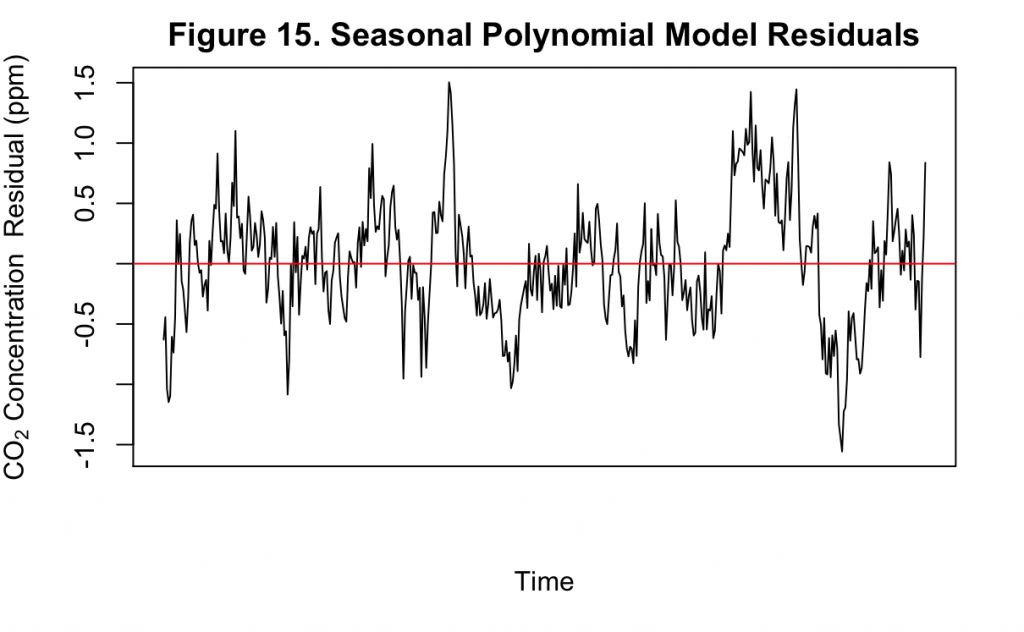
Figure 15 shows the residuals of the polynomial model with seasonal dummy variables. Though still fluctuating, the residuals now appear much closer to white noise compared to Figure 10. This is indicative of an improved fit. While there is still some cyclic pattern that can be observed, it is no longer clear nor consistent. These cycles indicate that there may be components in the original time series not yet accounted for by the model, however.
Finally, this best performing polynomial model can also be used to forecast values to the present.
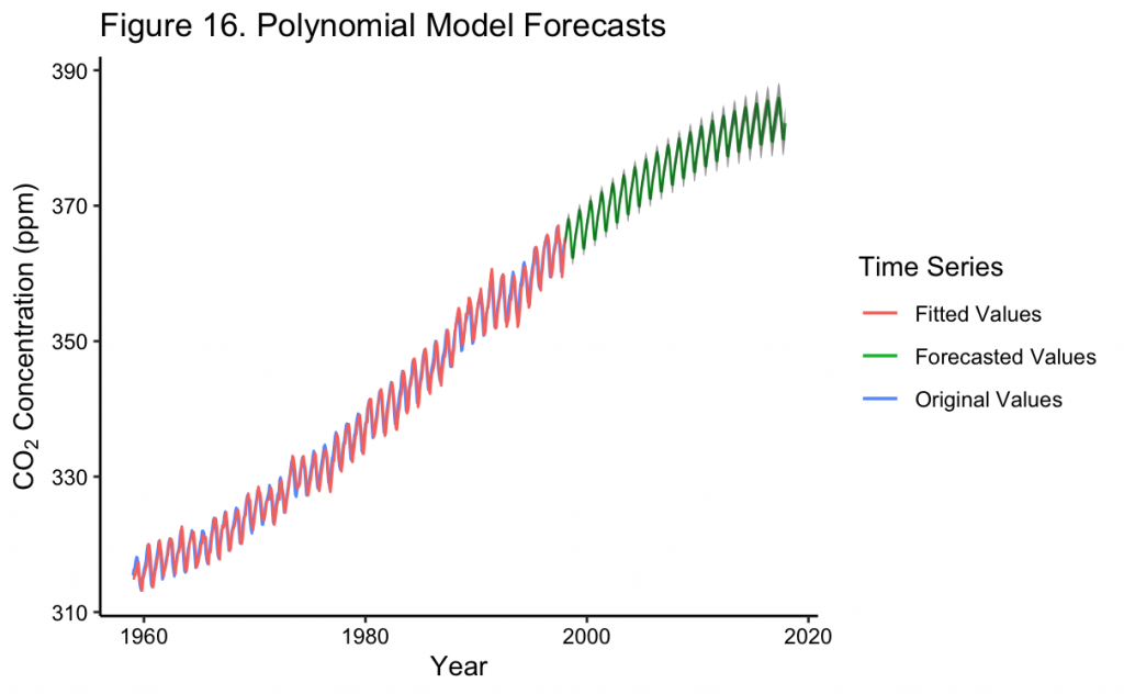
Figure 16 shows the original time series along with the polynomial trend and seasonal dummy variable fit. The forecast of the fitted model 20 years into the future is also shown. Finally, the confidence interval of the forecast is indicated by the transparent coloring around the values. It can be seen that these confidence intervals are quite tight to the forecast and do not project a large amount of uncertainty in the prediction. In general, uncertainty increases further into the future but not by an excessive amount.
In addition, the forecast generally predicts CO_2 concentrations to continue to increase, but at a decreasing rate. By 2017, it almost appears as if the forecast expects them to level off. However, knowing that CO_2 concentrations have continued to increase at about the same rate, this is inaccurate. Because of this, the model predicts a CO_2 concentration of about ~382 ppm by December 2017 when in reality the measured value is about ~407 ppm. Later on the forecasts will be compared with a full set of recorded values during this time.
SARIMA Modeling with Keeling Data
While a polynomial time trend with seasonal effects fit the data well in Figure 12, other methods may better capture the relationships within the data. These include the use of autoregressive (AR), moving average (MA), and/or integrated (I) terms. When used in tandem, this results in the ARIMA model that is one of the most common approaches in time series modeling. Without an I component, an ARMA model would take the form of:
x_t = \alpha_1*x_{t-1} + \alpha_2*x_{t-2} + … + \alpha_p*x_{t-p} + \beta_1*w_{t-1} + \beta_2*w_{t-2} + … + \beta_q*w_{t-q}
where x_t is the time series being modeled, p is the order of the AR process in the model, q is the order of the MA process in the model, w_t is white noise, and \beta are model parameters. It can be seen that, given the name, the AR components use the previous values of the time series in order to forecast future values. Similarly, the MA components use the white noise residual of previous model forecasts to true values to adjust future forecasts. The use of the backwards shift operator \boldsymbol{B}, common in math which involves time, can more succinctly express the above formula as:
\theta_p(\boldsymbol{B})x_t = \phi_q(\boldsymbol{B})w_t
With a differencing of order d, the short form can be extended to
\theta_p(\boldsymbol{B})(1-\boldsymbol{B})^dx_t = \phi_q(\boldsymbol{B})w_t
Finally, if seasonality is included into the model, a set of identical but separate model terms may be included to capture the seasonal variation while the original set captures the non-seasonal variation. The seasonal components are indicated by the capital letter version of the same previous terms, resulting in a final seasonal ARIMA (SARIMA) model of the form
\Theta_P(\boldsymbol{B}^s)\theta_p(\boldsymbol{B})(1-\boldsymbol{B}^s)^D(1-\boldsymbol{B})^dx_t = \Phi_Q(\boldsymbol{B}^s)\phi_q(\boldsymbol{B})w_t
where the seasonal and non-seasonal terms need not be of the same order, e.g. p = P or p \neq P.
Unlike the linear time trend, stationarity is needed for any SARIMA or ARIMA model. This will now be explored and compared to the previous linear time trend model.
As shown in the EDA, a second differenced time series is a better fit to the data than one with no differencing or only one difference. This would result in a value of d = 2 for the ARIMA model and potentially D = 2 for the seasonal component. Likewise, the ACF and PACF of the Figures 5 and 6 can also be used to estimate the seasonality of the model. In both figures it can clearly be seen that there is an annual seasonal pattern, which should be included to estimate a SARIMA model. With this determined, the time series can be split into seasonal and non-seasonal components to investigate the potentially different AR/MA terms of each.
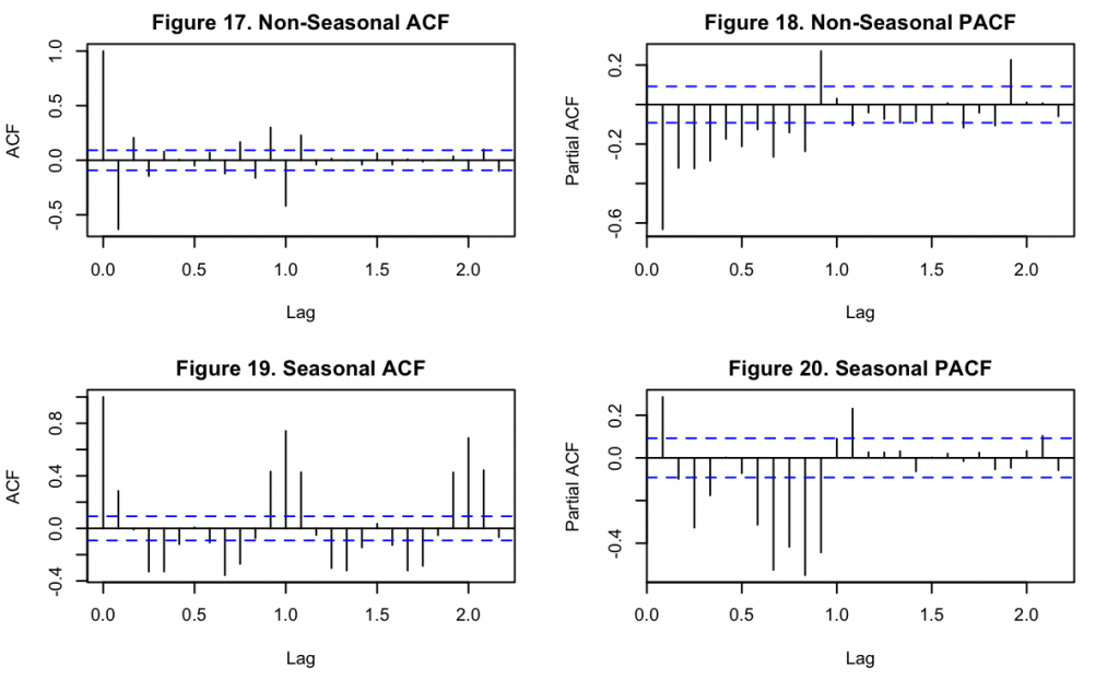
Figures 17-18 show the ACF and PACF of the non-seasonal time series component while Figures 19-20 show the same information for the seasonal component. It can be seen that the majority of the cyclic pattern is removed from the non-seasonal component once the lag difference was subtracted, but that some still remains with smaller magnitude. For the non-seasonal component, the single significant lag at k=1 in both Figures 17 and 18 suggests p = q = 1. There are more significant lags in Figure 18, but upon comparison with Figure 20 it appears these could be related to seasonality which was imperfectly removed. For the seasonal component of the time series, a similar observation can be made of Figure 19 and 20 that suggests P = Q = 1. Likewise, the significant lag at k = 3 in Figure 20 suggests that P could be higher order, but this may still be a product of the seasonality that is imperfectly isolated.
Although these values may be what are found when manually examining the time series, the use of an information criterion, such as the Akaike Information Criterion (AIC), to differentiate one potential model from others can also be used. This will be investigated for SARIMA models which vary from the above specifications by one or two orders for each of the components. To simplify the search, and because the order of the terms appeared similar above, the seasonal and non-seasonal components will be assumed to be of the same order (i.e. p = P, d = D, and q = Q).
When doing so, the SARIMA model with the best AIC had an order of p = P = 2, d = D = 1, and q = Q = 1. Notably, not performing a second differencing was found to fit better with the data. Having determined the order of each of the components, the final SARIMA model can be created on its own.
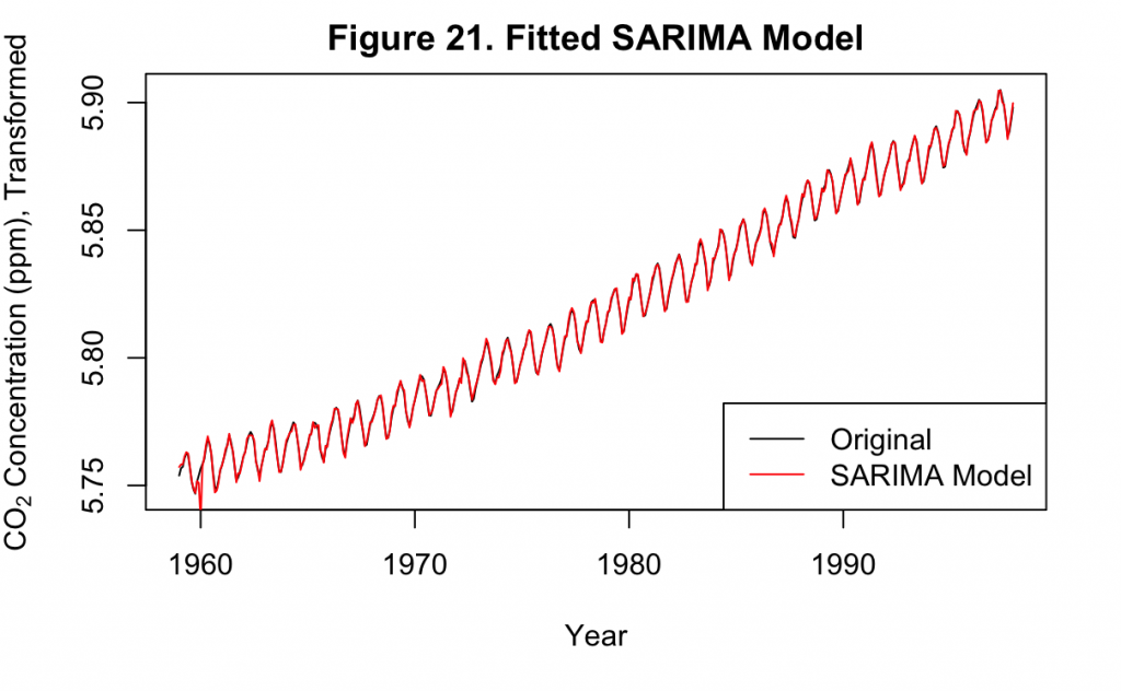
Figure 21 overlays the AIC-estimated SARIMA model with the original data. It can be seen that except for a small amount of jitter early in the time series, the model produces a very good fit.
The residuals may also be examined to investigate whether there is any remaining pattern not captured by the model.
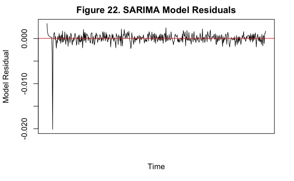
Figure 22 displays the residuals over time for the model, along with their mean value in red. There is a large fluctuation in the beginning of the model, corresponding to the error that is also seen in Figure 21. However, the rest of the series appears to resemble white noise indicating that the model specification is a good fit.
Finally, the model can be used to forecast values to the present.
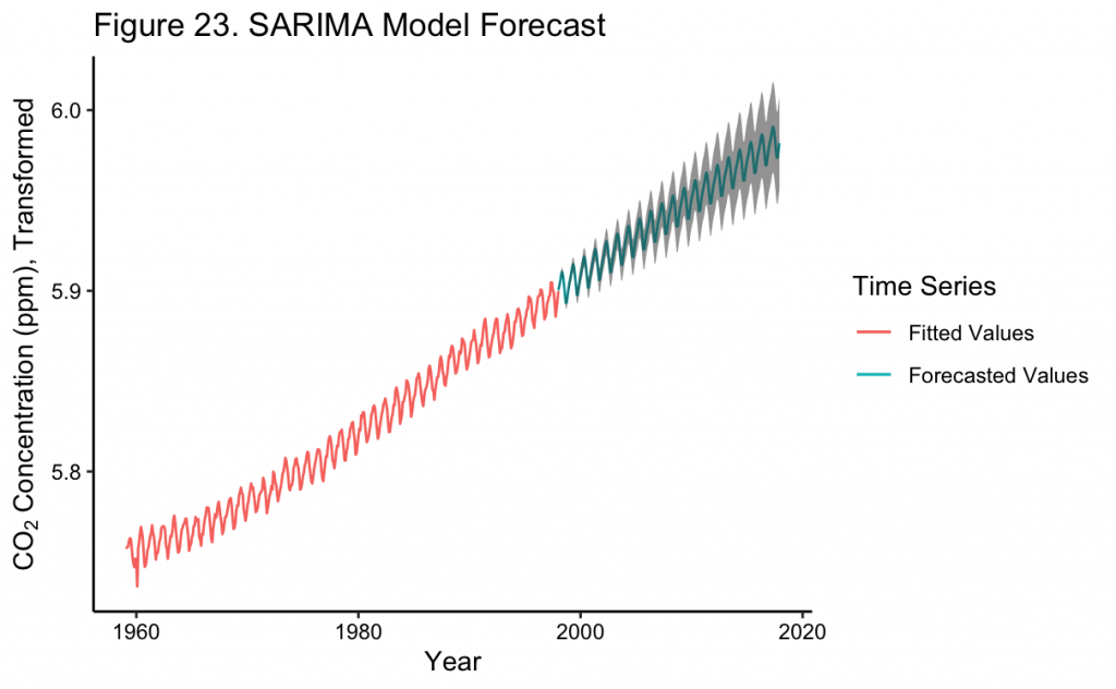
Figure 23 shows the forecast of the SARIMA model to the near present along with the 95% confidence intervals. As expected, the further into the future the model is used for forecasting, the wider the bounds become on the forecast. At the most recent point the model predicts a CO_2 concentration of about ~396 ppm, which is greater than the polynomial model and closer to the true recorded value of ~407 ppm. This is likely because the polynomial model increases at a decreasing rate over time, whereas the SARIMA model continues closer to the observed rate in the time series. With this, the SARIMA model appears to be a better fit to the time series than any of the time trend models even though there is greater uncertainty in its predictions.