Forecast Evaluation with NOAA Data
In addition to Keeling’s original observations, many other scientists across the world have studied the Earth’s atmosphere. One such group in the US is the National Oceanic and Atmospheric Administration (NOAA), whom continued Keeling’s original observations at the same site. The file `co2_weekly_mlo.txt` within the GitHub repository contains weekly observations of atmospheric CO_2 concentrations measured at the same Mauna Loa Observatory from 1974 to 2020, published by NOAA. With this new dataset containing observations over the forecast period, at the same location as the original data, it can be used as a source of true values against which to compare the different forecasts.
In addition to the measured concentrations of CO_2 in ppm, there is additional information provided by NOAA. For use as true values against which to compare a forecast, however, only the concentrations are needed. For this data, there are 18 missing weekly measurements of CO_2 concentrations, which need to be addressed. Potential options include dropping these dates or imputing the values with the surrounding data in time. This may be less desirable if there are serial missing values rather than isolated points which are missing.
Table 1. Missing NOAA CO_2 Concentration Measurements
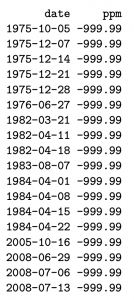
Shown in Table 1, it appears that there are a mixture of time periods containing missing values. For example, in 1975 there are no measurements for the entire month of December, while in 1982 there are two weeks worth of missing values for April. Similarly, in 1984 there are almost no data for April. For simplicity, the missing values may be replaced with the last available value. This will mean that for some consecutive missing points all values will be identical to the previously recorded point. For example, the four weeks in December 1975 will be identical to the last measurement from November 1975. Linear interpolation may also be used, but for simplicity this was not chosen.
With the missing data filled in, it can then be visualized to compare with the Keeling Curve of Figure 1.
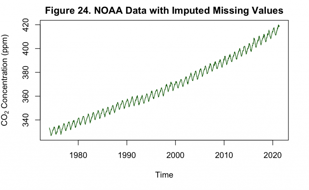
Based on Figures 24 and 1, the NOAA carbon dioxide measurements closely resemble that of the Keeling curve. In Figure 24 particularly, the imputation has not produced any obvious or drastic deviations from the overall seasonality and increasing trend. Unlike the original Keeling series, it does not appear that the variance of the trend is increasing. This can be double checked by decomposing the time series into constituent parts.
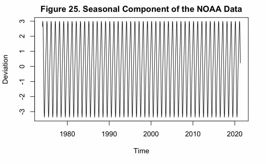
Figure 25 demonstrates that there is no variation in the seasonal component of the NOAA data, unlike that which was observed in Keeling’s dataset. This would make a logarithm transformation of this data unnecessary as it is already stationary in the variance. Next, the increasing mean must still be addressed, which can be done by differencing the values.
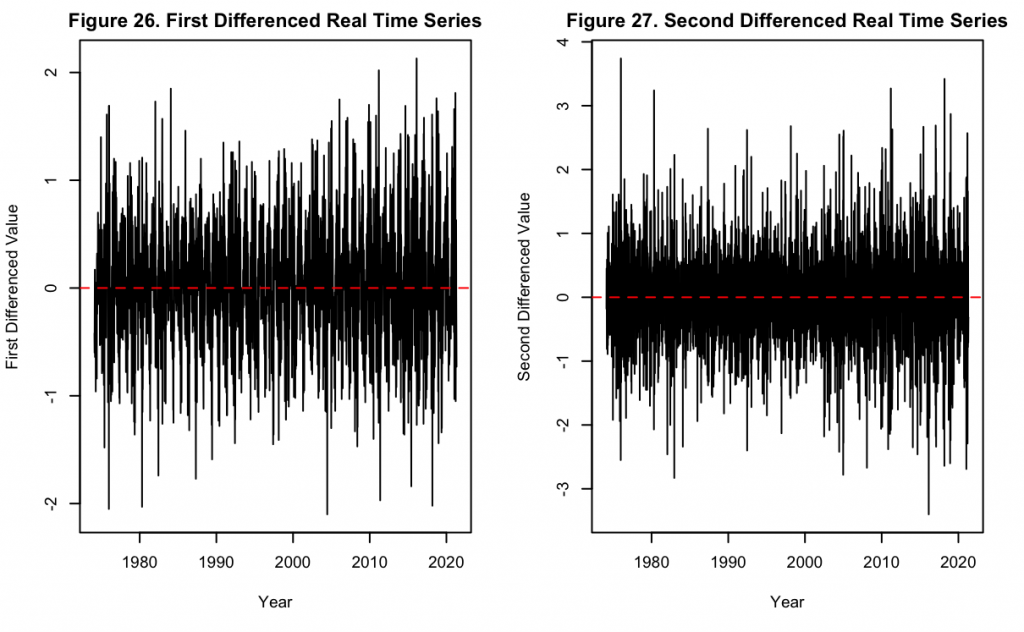
Figures 26 and 27 display the time series with first and second order differencing respectively. Similar to Keeling’s original series, it can be seen that though the differencing has removed the main increasing trend, there is still a degree of fluctuation about the mean. Compared to the original series, the increased granularity of data at the weekly level accentuates this fluctuation. Nevertheless, just like with Keeling’s series, a second-order differencing operation not only removes the increasing trend but the data also becomes completely stationary around the mean. Next, a deeper look into the seasonality of the data can be taken using the ACF and PACF.
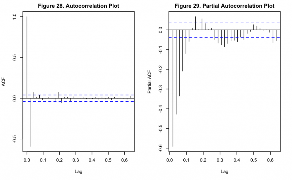
Figures 28 and 29 show the ACF and PACF of the NOAA data after second differencing. Unlike the ACF for Keeling’s data, the ACF for this dataset shows a substantial and highly significant negative lag at k = 1. Thereafter the lags drastically decrease, and it appears only the third and eighth lags are weakly significant. Like the Keeling series, the PACF has an oscillatory pattern that appears to be decreasing in magnitude over time. These all indicate a seasonal element may be present with the data.
For a more direct comparison with Keeling’s data and the previous forecasted values, aggregation can be performed to take the weekly (or approximately weekly) format into a monthly one.
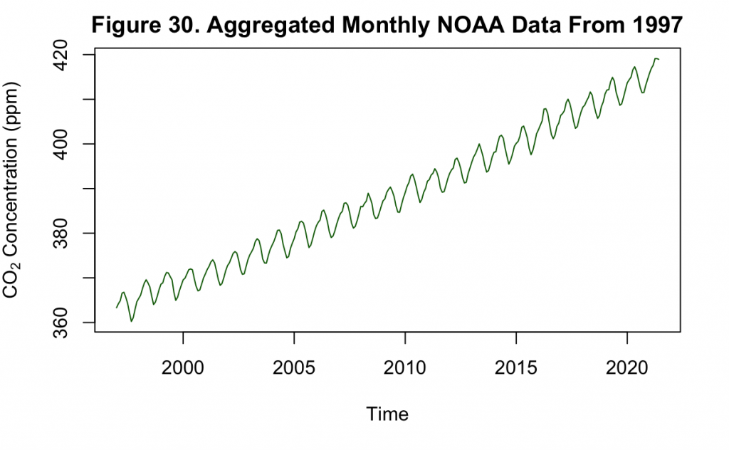
It can be seen from Figure 30 that the monthly aggregated time series generally resembles the original weekly series shown in Figure 24. Thus, this aggregation method does not significantly alter the data but puts it at the same grain as the Keeling dataset.
In order to compare the previous forecasts with the NOAA data, they may be visualized together.
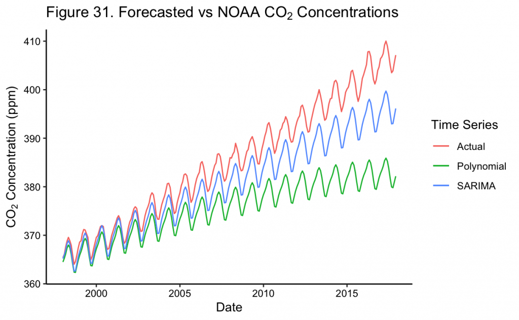
Shown in Figure 31, the SARIMA model generally predicts CO_2 levels very accurately, including seasonal variation, for the first six years until ~2003. Thereafter, the model begins to underestimate the true CO_2 levels, though it appears the cyclical variation remains well represented by the model. In comparison, though the polynomial can also provide a reasonable short-term forecast until ~2003, thereafter it begins to severely underestimate CO_2 levels even relative to the SARIMA model. In order to quantify the performance of each, metrics such as mean absolute error (MAE) and root mean squared error (RMSE) can be used, among others.
Table 2. Error Metrics of Keeling Models on NOAA Data
Model | MAE | RMSE |
Polynomial Time Trend | 9.723 | 11.849 |
SARIMA | 4.478 | 5.331 |
In Table 2, it can be seen that the SARIMA model quantitatively outperforms the polynomial model, with a MAE of about 4.5 compared to about 9.7 for the polynomial model and an RMSE of about 5.3 compared to about 11.9 for the polynomial model. Because of this and the visual evidence in Figure 31, the SARIMA model approximates the recorded NOAA data more closely. Nevertheless, if forecasting continued further, the SARIMA and actual values will further bifurcate both with the visual gap as well as in the error metrics.
SARIMA Modeling with NOAA Data
Previously, both types of models generally underestimated the concentrations of CO_2 in forecasts over the 20 years from 1997 to 2017. However, these models were based on the Keeling dataset, with only ~40 years of total data to begin with. In this case, the 20 year forecasting period was half the size of the original training period. Such long forecasts, especially when the length of the forecast is comparable to the training period length, are inadvisable and may not yield significant information.
In certain use cases, including atmospheric or planetary science, long term forecasting may still be important and preferable. However, for understanding and comparing model types, short term forecasts can be useful when first deciding on which models or characteristics may be important for one which is longer term. Following this notion, a SARIMA model will be fit and evaluated only on a two-year forecast before a long term projection is created.
To begin, the NOAA data will be re-partitioned into the training and testing sets and evaluated for transformations.
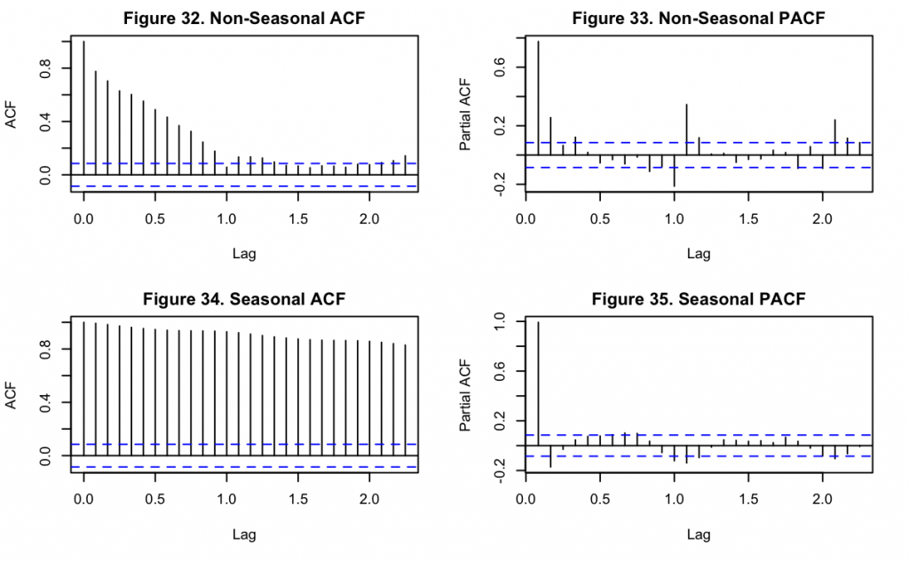
Based upon the above non-seasonal (Figures 32 and 33) and seasonal (Figures 34 and 35) ACF and PACF plots, there is an element of seasonality in the data as the non-seasonal ACF (Figure 32) still shows a cyclic pattern from the first lag onward. Similarly, the non-seasonal PACF (Figure 33) shows a significant spike at the first lag, with a slightly smaller (yet still significant) lag at the second. It can then be observed that after differencing and accounting for seasonality, the seasonal PACF (Figure 35) has a significant spike at the first, second, eleventh and twelfth month lags. This indicates that an AR(1) or AR(2) model should be chosen, since only the first two immediate periods are significant before the seasonal pattern begins. Moreover in Figure 34, though every lag appears to be highly significant, the autocorrelations greater than the second lag might be caused by propagation of first lag’s autocorrelation.
Based upon this, an autoregressive model of this data should be of at least the first order, with a differencing term of one as well. Nevertheless, due to the high number of significant lags in Figure 34, a moving average parameter may also be important to incorporate into the model. In order to find the best possible model, combinations of orders for p, d, q, and their seasonal equivalents can be created and compared with one another. Instead of making simultaneous forecasts, potentially causing an issue with the number of comparisons being made, they can be compared based on the AIC as done previously.
Using AIC, the 147th model produced the best fit. This model had SARIMA parameters p=1, d=1, and q=1, with seasonal parameters of P=0, D=1 and Q=1, and an annual seasonality as used before.
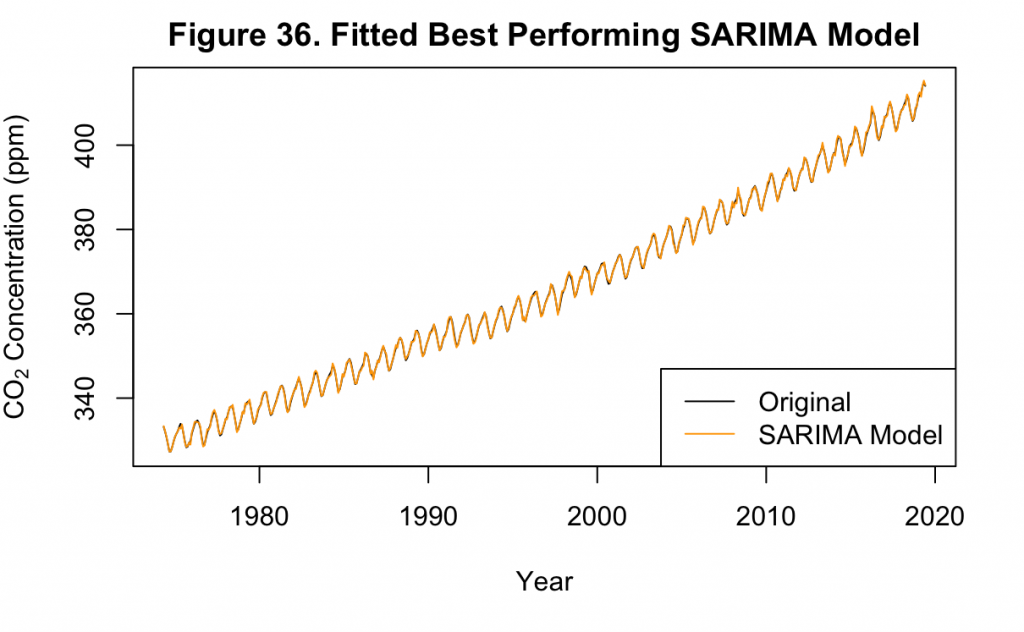
Figure 36 shows the best fit SARIMA model on the dataset, which matches the original data almost identically. This is similar to the fit of the original SARIMA model to Keeling’s data in Figure 21.
The residuals of the model can also be examined.
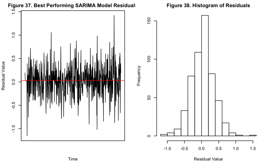
Figures 37 and 38 show the residuals of the model over time along with their distribution. It can be seen that there is no obvious pattern remaining in Figure 37, suggesting the model accounts for the majority of the components in the underlying data. Likewise the distribution appears normal, also suggesting there is no remaining trend in the data not accounted for by the applied transformations and modeling.
Following this visual inspection, the in-sample model performance metrics can be examined.
Table 3. Error Metrics of NOAA Model on NOAA Train Data
Model | MAE | RMSE |
SARIMA | 0.251 | 0.327 |
Based upon Figure 36 and Table 3, the best performing model has a fit that is almost identical to the training set values. This is evidenced by the fact that it is not easy to visually differentiate the fitted values from the real values, and there are only small locations where there is not an exact overlap. In the performance metrics shown above, the in-sample performance achieves a MAE of about 0.25 and a RMSE of about 0.33, which reinforce the visual findings. While reassuring that the model has fit the training data, it is also important that this does not extend to the point of overfitting where any forecast would not be valuable. However, with only three terms in the model, this is not likely.
Next, this model may be used to forecast for the next two years, which corresponds to the testing set. These predictions and true values can be visualized together.
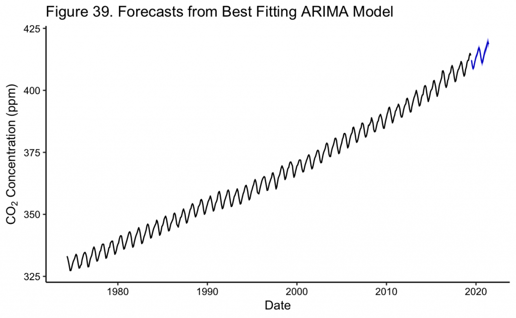
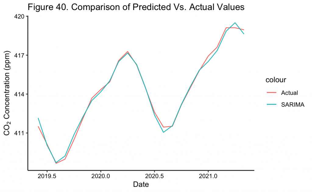
In Figure 39 the two year prediction of the SARIMA(1,1,1)(0,1,1)[12] model can be seen as a continuation of the previous trend. Moreover, the confidence intervals are extremely narrow to the point of being almost indistinguishable from the mean values. This might be due to over-fitting of the model during training which incorrectly improves its confidence, or the fact that it is a relatively short-term forecast. However, upon closer inspection in Figure 40, the CO_2 forecasts almost completely overlap the true values. This implies that the model and its transformations were well specified for the forecast to so closely match. Specifically, for June 2020, the short term forecast of the model is about ~416 ppm, matching the value NOAA later recorded to the nearest whole number.^{[3]}
With the forecast made, the out of sample error metrics may be calculated.
Table 4. Error Metrics of NOAA Model on NOAA Test Data
Model | MAE | RMSE |
SARIMA | 1.153 | 1.253 |
Now in Table 4, on the testing dataset, the MAE is about 1.2 while the RMSE is about 1.3. These values are very low given the range of the outcome variable in the hundreds of ppm. Together with the visual inspection conducted previously, it may be concluded that the SARIMA model fits these CO_2 concentrations very well. While this is a positive initial result, it should be remembered that this is a relatively short-term forecast at 24 months, with one value predicted per month. Longer term forecasts should still be taken with a grain of salt even though the results show promise on the shorter term, as any errors will accumulate and lead to greater divergence between the true and predicted values. With the increase in error between the training and testing datasets of Tables 3 and 4, this should be considered for longer forecasts.
While any long term predictions should be interpreted with less certainty, sometimes they are more important or interesting to investigate than the short term. For example, some scientists have noted that the most recent time in Earth’s history where CO_2 concentrations were this high is estimated to be the Pliocene era^{[1]}, raising questions for how this atmospheric change could lead to other changes among the Earth’s processes.
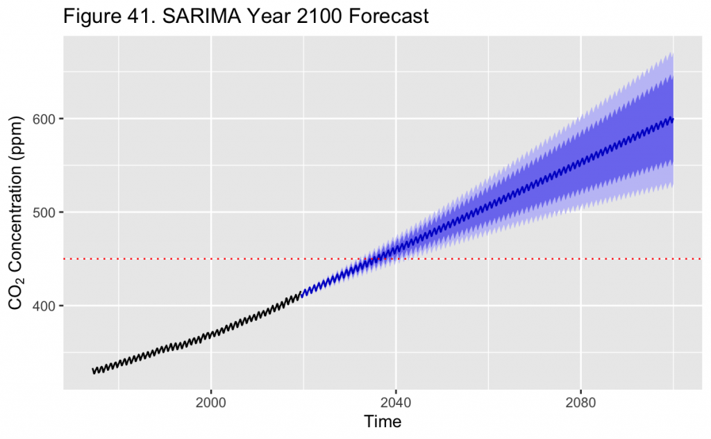
According to the final model and depicted by the dotted red line in Figure 41, CO_2 concentrations are expected to reach or exceed 450 ppm in March 2035. The 95% confidence interval for this month is between about 441 and 459 ppm. This level is notable as it is about the maximum allowable CO_2 concentration in the RCP2.6 modeling scenario^{[2]}, which is considered the mildest put forth by researchers. In this scenario, peak CO_2 concentrations in the atmosphere should occur between ~2040-2050, which would result in an increase of an estimated 2°C in global mean temperature. With the model forecast in this project putting this concentration passed in 2035, it is likely that the Earth will experience a more greatly changing climate than this scenario describes.
Figure 41 also shows a ~1000 month forecast from June 2019, about until the year 2100. The trend the model predicts is approximately linear at such a long timescale. Nevertheless, the uncertainty in the predictions also increases the further a prediction is made into the future, shown by the widening 95% confidence intervals. When considering this, 450 ppm is first reached by the upper 95% confidence interval in approximately ~2032 and could be as late as ~2040. Thus, while it may be predicted that in January 2100 the point estimate of CO_2 levels will be about 600 ppm, the 95% confidence interval is extremely wide and between about 530 and 671 ppm. Consequently this indicates that the model should not be used to make predictions so far ahead into the future with certainty, and only used as a general estimate of where concentrations are headed.
Citations
[1] https://climate.nasa.gov/climate_resources/7/graphic-carbon-dioxide-hits-new-high/
[2] van Vuuren, D.P., Stehfest, E., den Elzen, M.G.J. et al. RCP2.6: exploring the possibility to keep global mean temperature increase below 2°C. Climatic Change 109, 95 (2011). https://doi.org/10.1007/s10584-011-0152-3
[3] https://gml.noaa.gov/webdata/ccgg/trends/co2/co2_mm_mlo.txt